Bus Stop Content
- branding
- identity
The Brief
Bus Stop Content came with a name, a clear sense of who they were, and nothing else. As a social media and public relations agency serving racing drivers, they needed an identity that could hold its own in the motorsport industry.
The Name
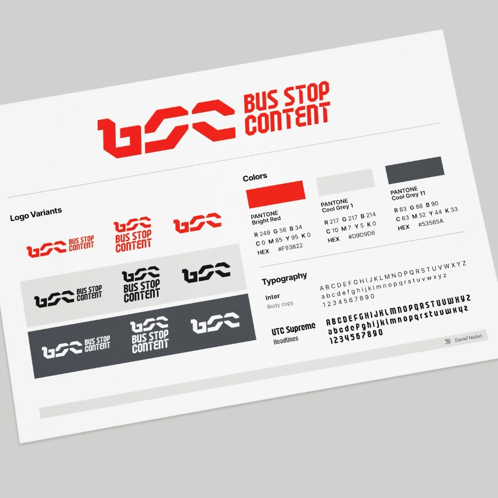
The name references the Bus Stop chicane at Daytona International Speedway. That piece of track history became the foundation of the entire visual identity.
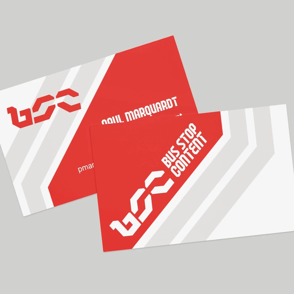
The Mark
I hand-lettered a BSC monogram with the chicane embedded in the negative space of the letterforms. The constraint was real: the track reference needed to read as recognisable motorsport iconography, while each of the three initials had to remain independently legible. Getting both to coexist without competing took significant iteration — the kind of problem that looks simple and isn’t.
The Palette
The colour story is a deliberate piece of industry self-awareness. Red, dark grey, and light grey are the running joke in sports car racing — the so-called corporate racing colors, the default palette of a thousand unnamed teams. We leaned into it. It lands immediately with anyone who’s spent time in the paddock.
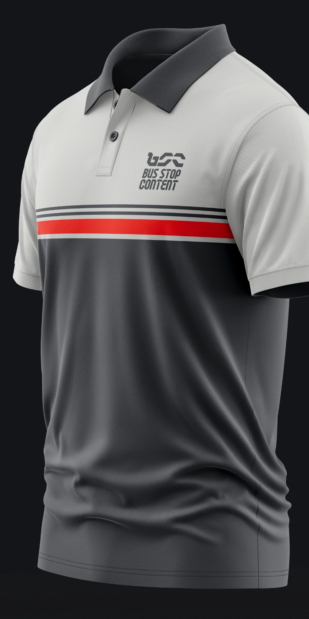
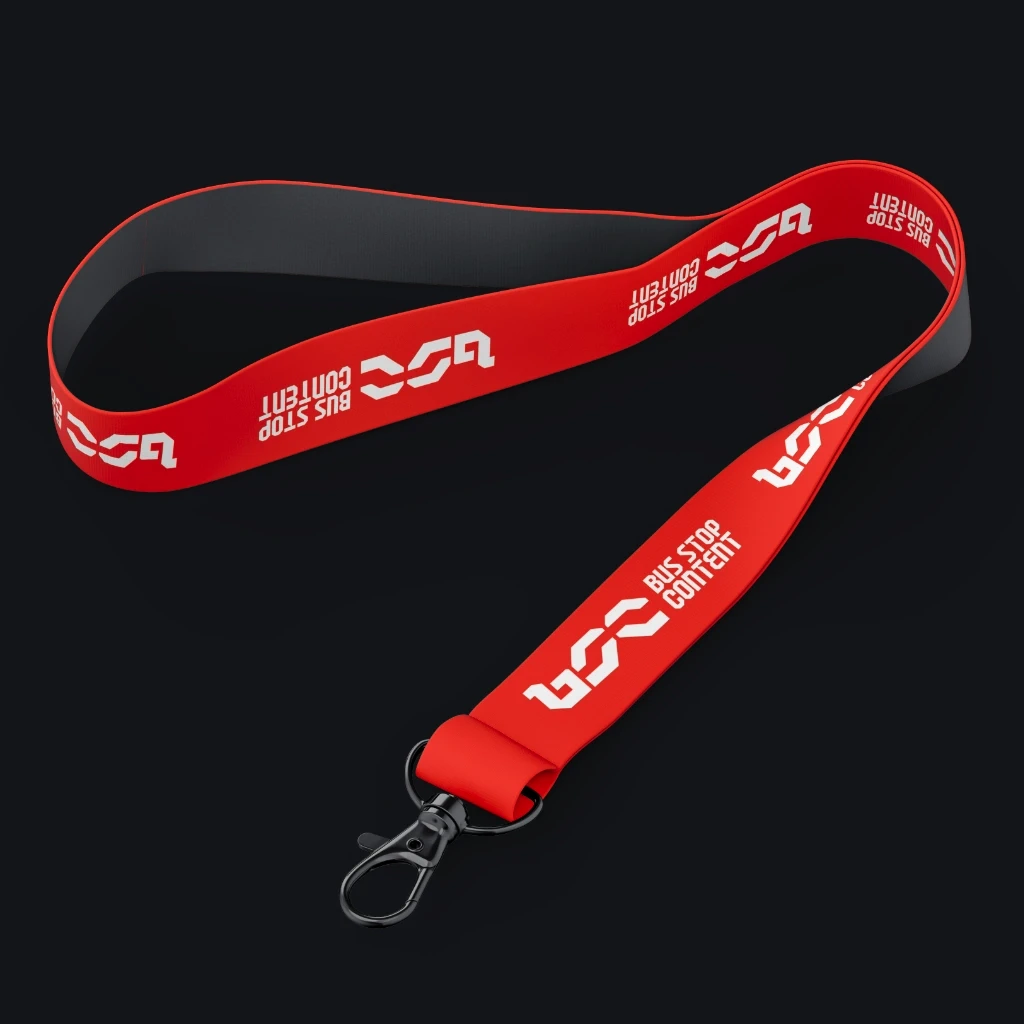
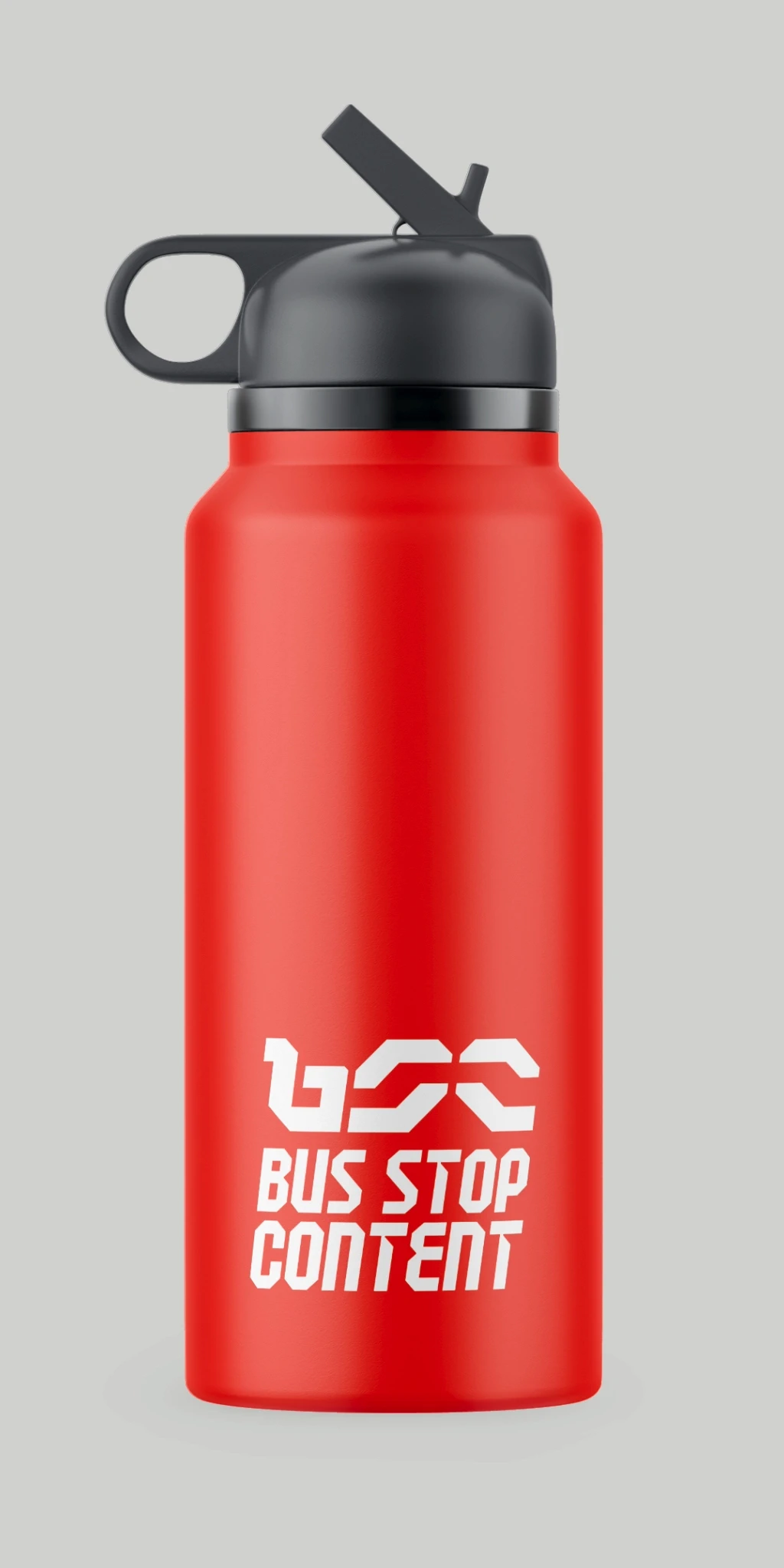
The System
The identity extended across business cards, lanyards, apparel, branded merchandise, and a set of guidelines to keep it consistent as the agency grew.