Becoming Wilder
2021
- branding
- identity
The Brief
Becoming Wilder came with an unusually clear brief: five words that needed to be true of everything we made. Sexy, sensual, free, playful, empowering. No hedging, no softening — every decision had to earn its place against that list.
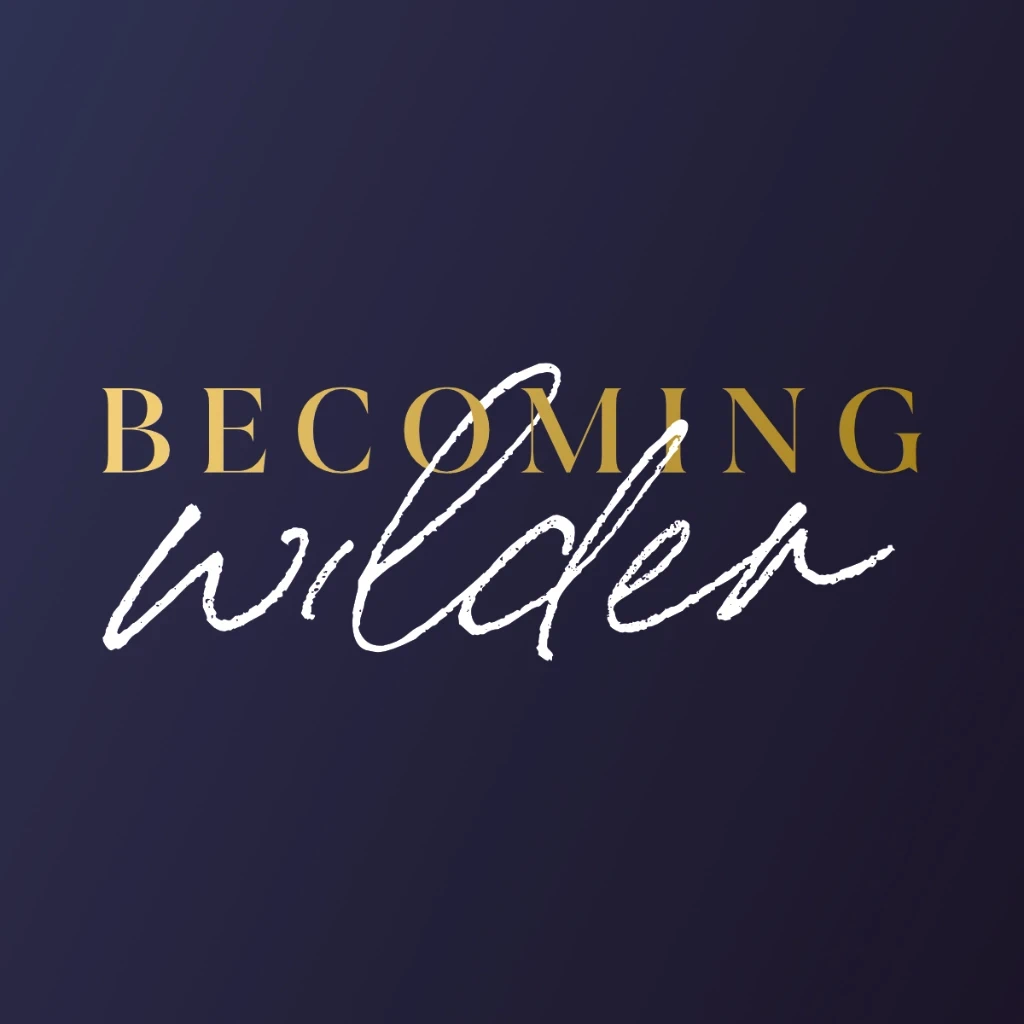
The Mark
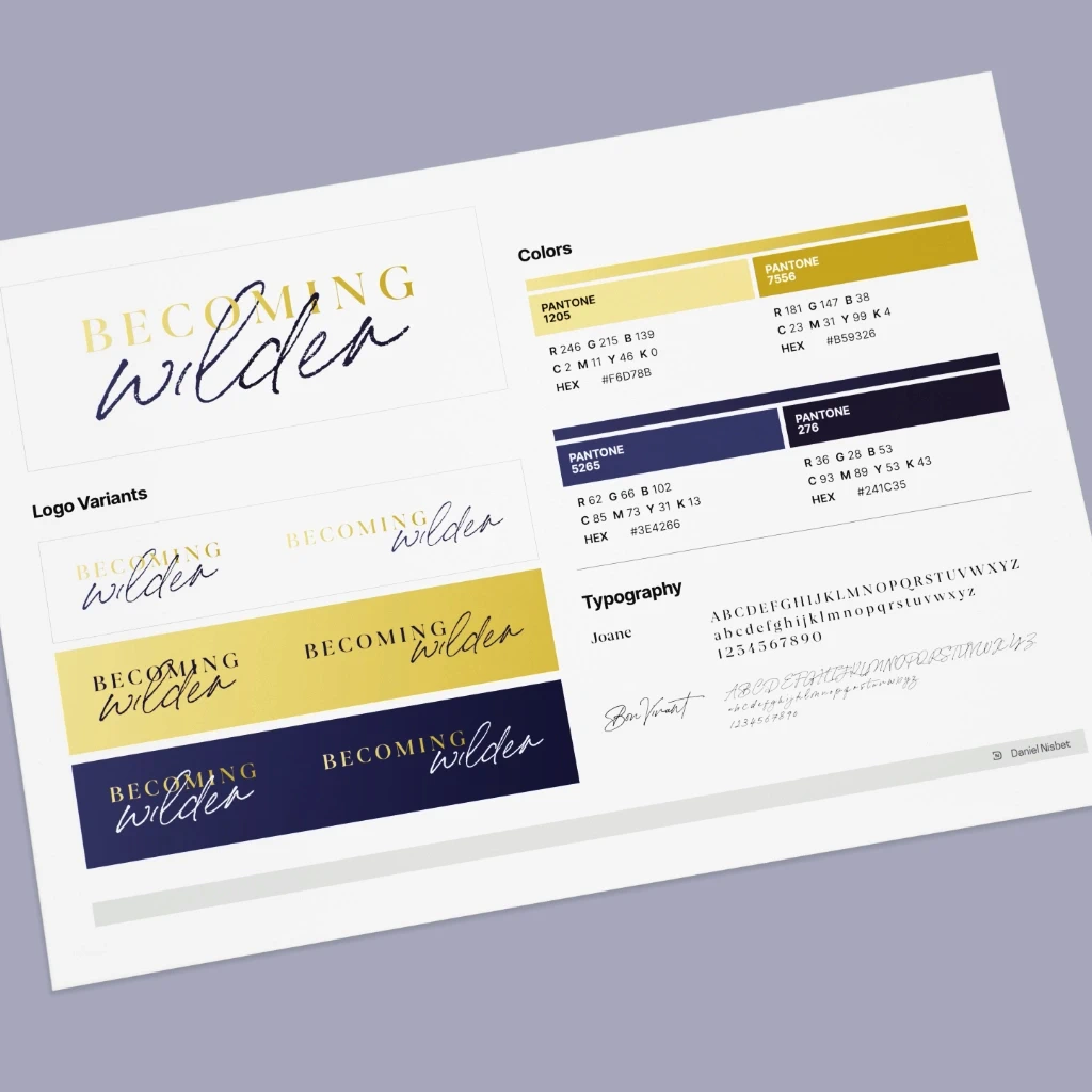
The logo brings the pillars to life through contrast: a refined, elegant serif intertwining with a bold hand-written script. The tension between the two letterforms is the point — discipline and freedom, structure and expression, locked together into a single mark that holds both without resolving either.
At the intersections where script meets serif, legibility was resolved letterform by letterform. Reducing to a single colour meant nothing could bleed into its neighbour — each junction was worked out individually to keep both typefaces intact at any size.
The Palette
A deep, rich purple offset by a metallic gold. Gradients extend the palette for digital and merchandise applications, adding dimension through subtle ombre effects without pulling the brand away from its core tone.
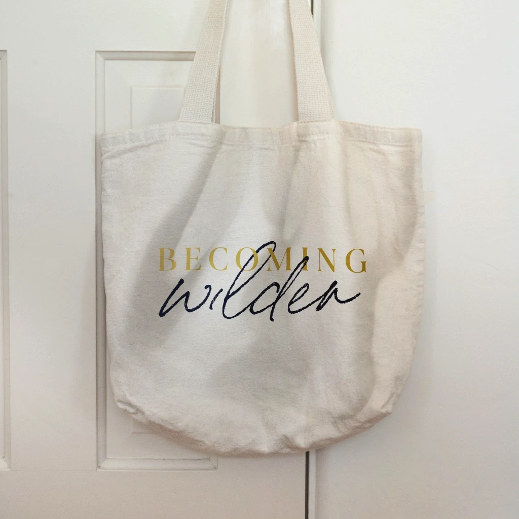
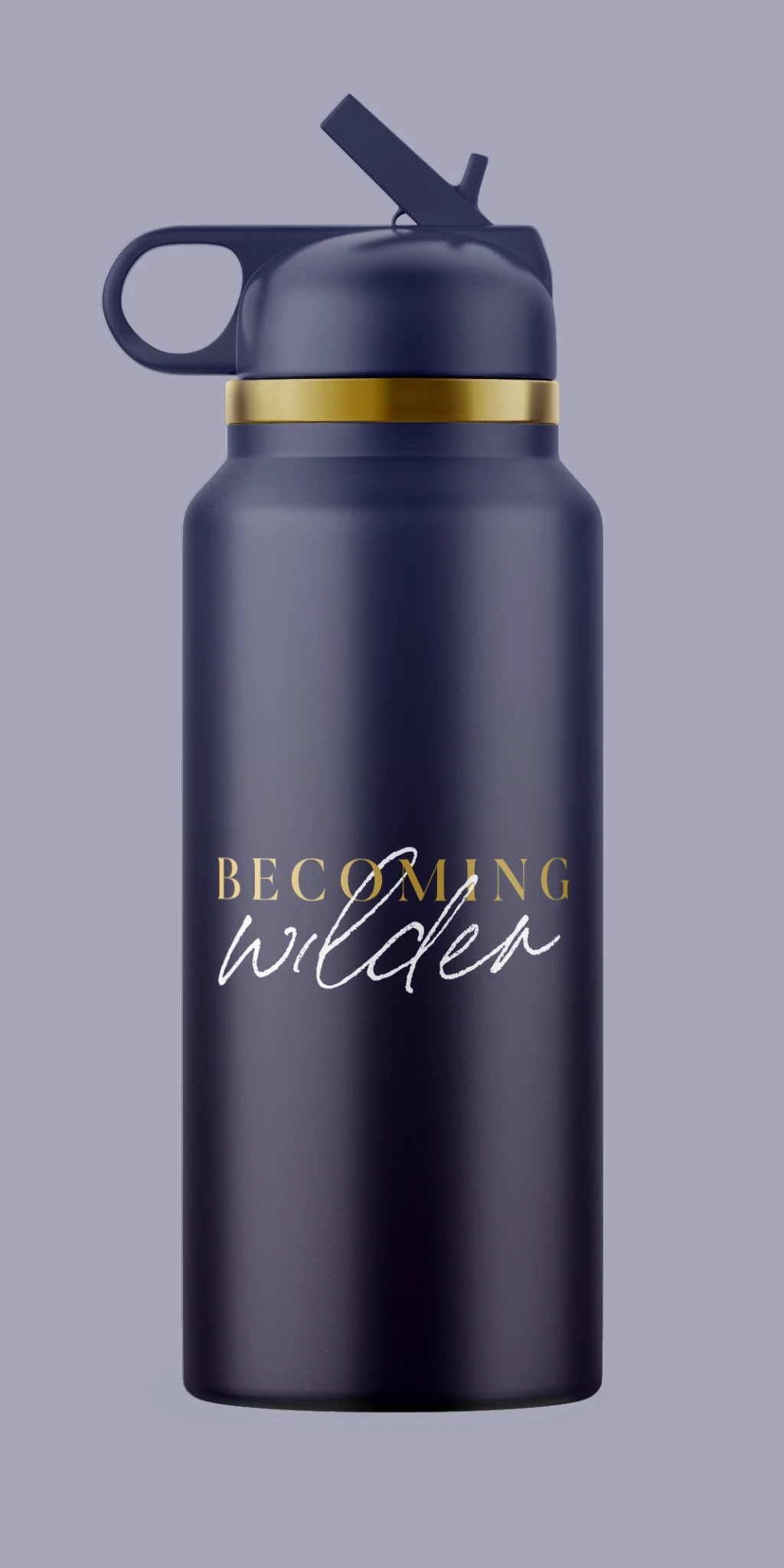
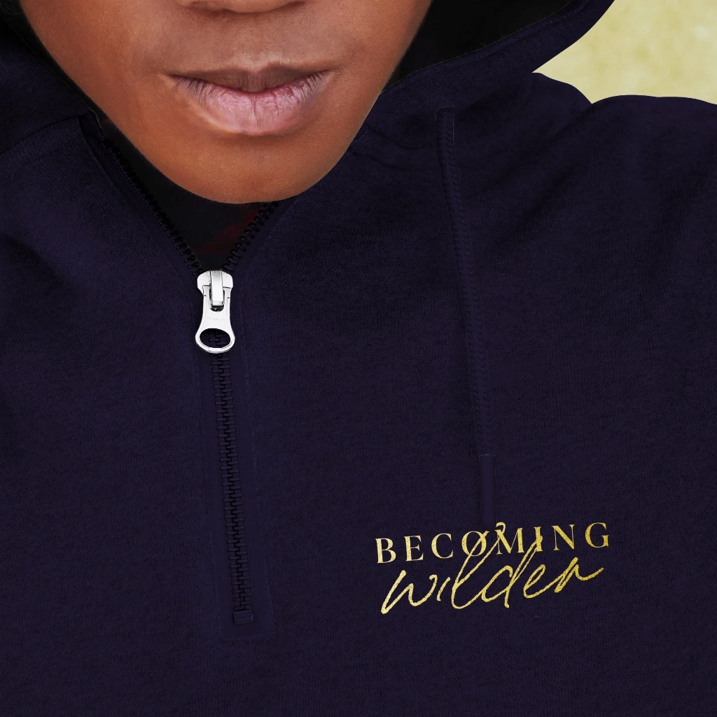
The System
The identity was built to travel — applied across packaging, apparel, and digital touchpoints, consistent whether it’s embossed on a product or displayed full-bleed on screen.